The objective and challenge was to create an original athletic brand that stood out amongst a sea of subpar highschool logos. It was important to have a strong and iconic design where the various elements could be used together or separately. The Bruin head can and should be able to stand alone, as can the Padua Franciscan Bruins word mark, this gives the logo some versatility and adaptability that sets it apart. On top of the primary logo, a secondary and tertiary logo were developed to add variety to the family. We made the orange, oranger – before it was cool.


When setting out to design a new athletic logo, I needed the Bruin to be intimidating, but not violent. I went through about two dozen concepts in order to strike the right balance. It needed to represent the student body as a whole on and off the field.
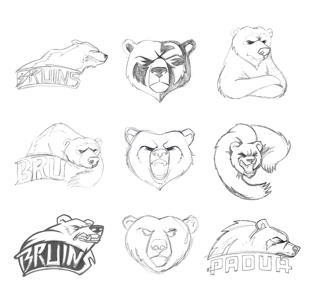
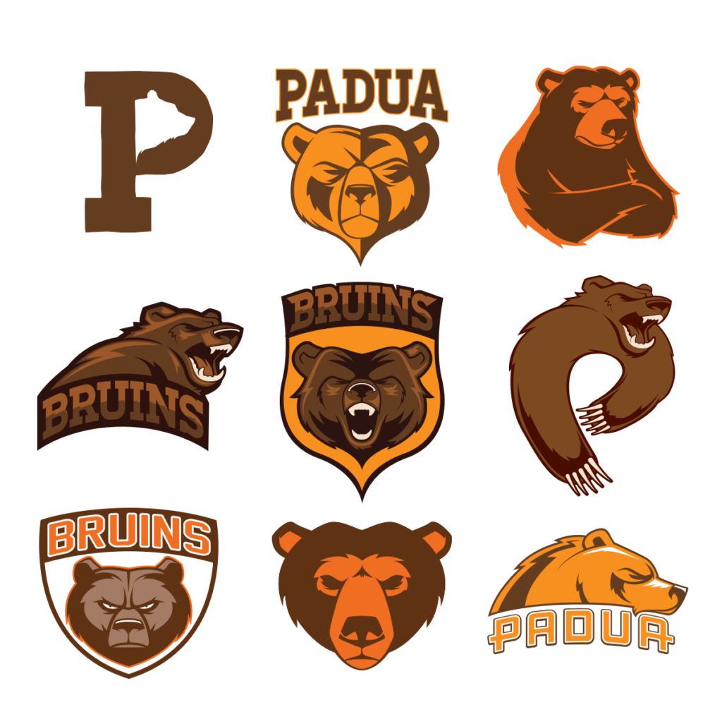
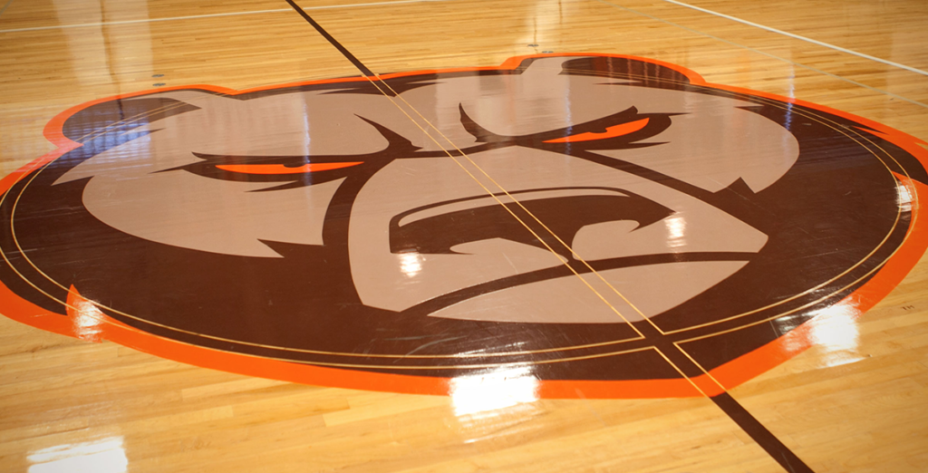
The final logo has become Padua Franciscan High School’s primary logo, painted on their gym floor and embodied on their baseball caps the ‘angry bear’ (which is what the children have affectionately named him) will hopefully be used for years to come. In a sea where schools tend to ‘borrow’ pro or collegiate level logos, he stands head and shoulders above the rest.
© 2013 All rights reserved. All work created by Joe Rossi. This project was done while working for 427 Design for Padua Franciscan High School, located in Parma, Ohio.